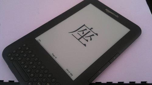
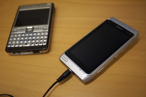
Decided to start mobilize my kanji studying by more modern means than carrying a book around, so I've begun typing them down in suitable chunks into pdf documents, which double as flash cards on both the Kindle and the N8. One page shows the kanji, the next the kanji with readings and explanation. And repeat that a few thousand times.
Sunday, February 27, 2011
Sunday, February 20, 2011
Flat
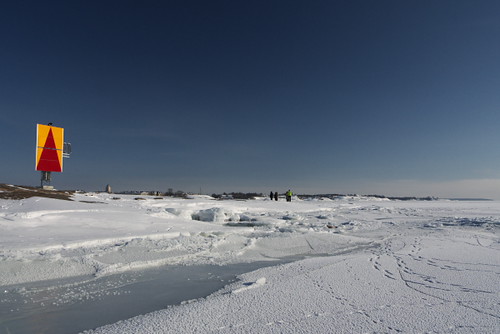
Keep going over there, and eventually you'd end up in Estonia. Unfortunately some open shipping lanes in between, though.
Icebound Island
One of the outer rocks outside Helsinki. Rare to have such good weather and solid ice to walk out there on.
Friday, February 18, 2011
雪うんこ
Spotted a message in the snow near the Aalto Uni Art and Design faculty this morning. Perhaps a Japanese exchange student fed up with the snow (as far as I can read that)?
Thursday, February 17, 2011
N8 Panorama
Nokia's own Automatic Panorama application has been a pleasant surprise on the N8. Dead simple to use, and giving good results. Good stuff.
Thursday, February 10, 2011
Blue and Pink
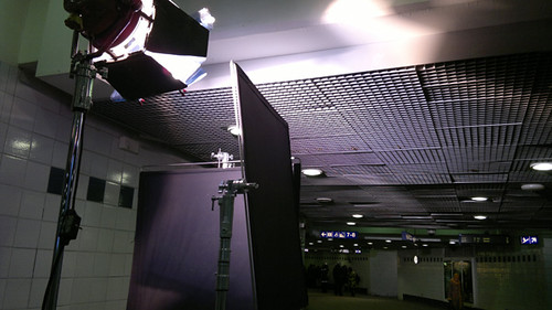
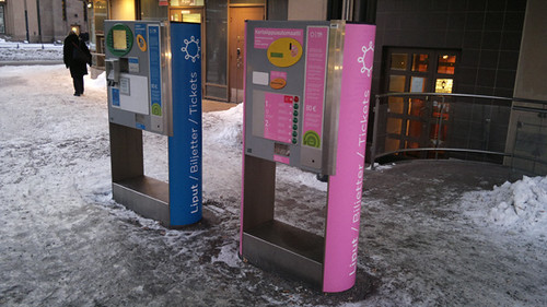
Decent quality shot out of the N8. Looks promising for a compact camera replacement, as intended.
The blue one is for public transport tickets and charging travel passes, the pink one only sells single rides. Perhaps a division born out of necessity, though I've never seen any long lines on the regular vending machines before.
Wednesday, February 09, 2011
New Tool for a Trade
Good enough camera, meaning I don't have to carry the GF1 in all situations. Enough connectivity to get by for now. And navigation won't hurt either (just heard rumors that the Ovi maps for Japan aren't really up to par). Should get the job done.
Monday, February 07, 2011
Take a Book
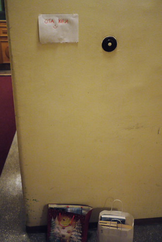
Someone in the house is either moving out or cleaning. A couple of bags with random books by the front door downstairs, with a note to take any you fancy. Picked up something I'd probably never buy, but which might be entertaining. Thank you.
Train Window
Train Window, originally uploaded by Rollofunk.
Been seeing a lot of this recently. Today the weather was pretty OK, so a short video was in order.
Friday, February 04, 2011
Service Design Fail
It's rare for me to rant about a bad service, I like to emphasize good service more, but SAS seems to have some serious issues with making a half-baked campaign in the Plan Your Points -thing I made the mistake to join.
The Idea was to score some extra milage points by stating how many Star Alliance flights you were about to take within a certain period of time. If you flew the correct amount, you get bonus points. Sounds good, presented well in a nice e-mail, and since we were going to Copenhagen within the correct timespace, I joined. All good so far.
During our trip we did check-in both ways via Internet, so the only interaction with SAS staff at the airport was baggage drop desk and boarding gate. No questions, and no hint to swipe the mileage card anywhere, or type the number. Result: No flights as far as the system is concerned, and I'm sent an e-mail telling me I didn't fly during the given time. Excuse me, but I'd like to challenge that statement.
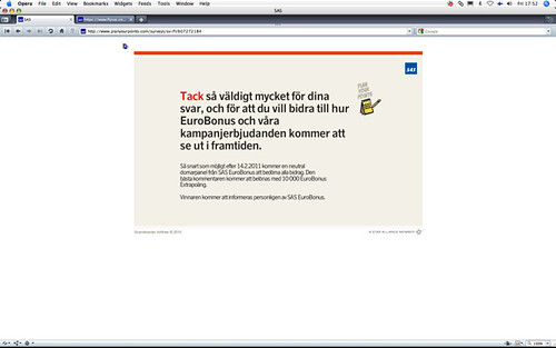
Challenge it I did, using the helpfully provided feedback survey. Didn't even write all caps-lock in the free comment field. Still, adding the final nail to the experience coffin, they don't provide any "exit" or "back" button at the end of the survey. Get real SAS.
I'm sure that campaign looked nice in the planning stage, but whoever designed it left their homework undone in not considering all the possible user scenarios for taking a flight. That's a sure way to create bad user experiences, and I don't think that's the goal they had in mind when they started.
