It's rare for me to rant about a bad service, I like to emphasize good service more, but SAS seems to have some serious issues with making a half-baked campaign in the Plan Your Points -thing I made the mistake to join.
The Idea was to score some extra milage points by stating how many Star Alliance flights you were about to take within a certain period of time. If you flew the correct amount, you get bonus points. Sounds good, presented well in a nice e-mail, and since we were going to Copenhagen within the correct timespace, I joined. All good so far.
During our trip we did check-in both ways via Internet, so the only interaction with SAS staff at the airport was baggage drop desk and boarding gate. No questions, and no hint to swipe the mileage card anywhere, or type the number. Result: No flights as far as the system is concerned, and I'm sent an e-mail telling me I didn't fly during the given time. Excuse me, but I'd like to challenge that statement.
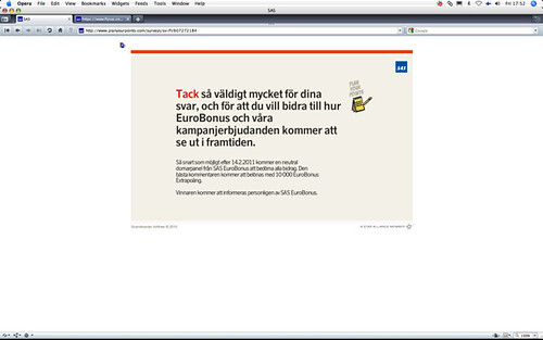
Challenge it I did, using the helpfully provided feedback survey. Didn't even write all caps-lock in the free comment field. Still, adding the final nail to the experience coffin, they don't provide any "exit" or "back" button at the end of the survey. Get real SAS.
I'm sure that campaign looked nice in the planning stage, but whoever designed it left their homework undone in not considering all the possible user scenarios for taking a flight. That's a sure way to create bad user experiences, and I don't think that's the goal they had in mind when they started.
Friday, February 04, 2011
Service Design Fail
Subscribe to:
Post Comments (Atom)


No comments:
Post a Comment