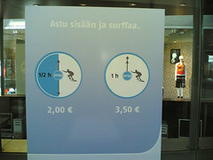
Surfing Time
Originally uploaded by Rollofunk.
That's a funny way of telling what's on offer.
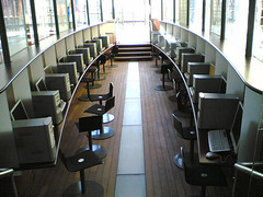
Plenty of computers, and nobody using them. Could it be that people are already connected enough. The Internet is present at home, at school, at work, in libraries and even in my mobile phone, so maybe people don't need it like this anymore? Are people from out of town, who don't know the free places to surf, enough to keep places like this going?
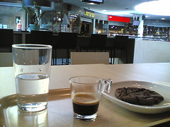
A new cafe at the top floor of the Kamppi shopping centre. The espresso was not bad, but took ages to make, and there was no chocolate included. The cup, or should I say glass, was cool, however.
As for the surroundings there are lot's of street fashion shops around, and plenty of young people come here to hang out. Not much variety in the clientele, really. The music was loungy and nice.
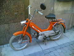
Yes, summer is definately coming, again in the form of classic Finnish two wheeler design. The one-piece frame of this Solifer moped is actually pretty neat. And check out the size of the rear view mirror.
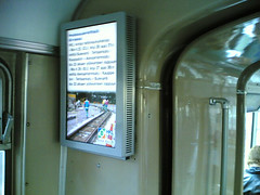
I've always had some reservations about the old German trams Helsinki City Transportation has been using for about a year now. I mean, they remind me about my childhood, which unfortunately is quite far in the past. Everything retro isn't cool.
Today I was forced to take one, and they actually have a nice feature: Two state of the art screens which show useful information instead of commercials. Traffic info, weather forecasts and so on. The casing isn't maybe the most beautiful there is, but still better than the one the UIAH people had knocked together for their MoA 2006 exhibition promotion tram. If this one was painted with that lovely beige of the wall it might actually blend in nicely.
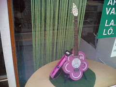
It would take a seriously tough metal band to play this instrument on stage. Notice the pink fur strap. Nice...
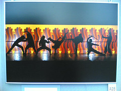
Went to see an exhibition of the best advertisement photography of last year. The interesting thing was that most were shown without the commercial connection, and were there just as plain pictures. Or not so plain, actually. Some were pretty good, like this Martial Arts image.
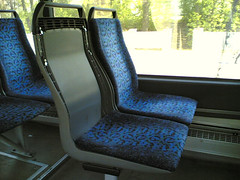
Cushions on bus seats seem to be too easy to remove. A guy actually sat in this seat, but I got off before him so I don't know if he tore his jacket at the metal hooks sticking out.
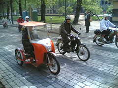
Some chose to cruise in comfort. That would be so cool with a foldable roof for those sunny days.
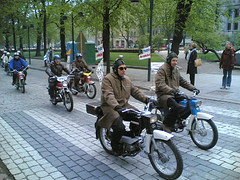
Downtown Helsinki saw (and most likely heard as well) a caravan of perhaps 100 mopeds. Beat that, Hell's Angels.
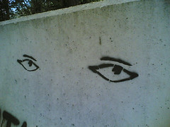
Looking sleepy or seductive? Hard to say with block of concrete.
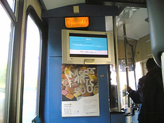
The tram was equipped with a nice flatscreen with programs promoting the exhibition. The way it was fastened to the wall just looked like something done in the metal workshop the previous night.
I don't know if anyone actually follows the program, but I tried, and was a bit annoyed that they showed long interviews with really low sound on the screen. Couldn't hear a thing of what was being said. They probably didn't know that they couldn't have it on full volume when they planned the video loop. Better luck next year, maybe.
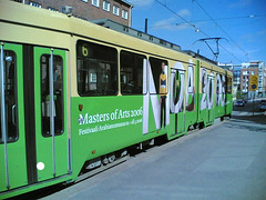
Got to ride the Helsinki city tram sponsored by the MoA 2006 exhibition today. Why does that exhibition pop up all the time in this blog?
Anyway, kind of interesting that they bothered to tape the whole green part of the tram again with slightly lighter green. Too big marketing budget perhaps?
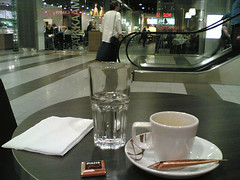
One of the espresso's today was had at Cafe Camppi. A bit on the expensive side at €2.50, but the location is good for watching people who stress with shopping in the brand new centre.
The cup is actually double size, and even the single espresso fills it up nicely. The taste is just like strongly brewed regular coffee, though. Lacks the smoothness. Sugar is always included, but just an unnecessary accsessory for me. Hope they reuse the tubes that aren't opened. Anyway, I vote for a sugar jar instead. The chocolate looks the part in it's package, but is actually milk chocolate.
Verdict: could be a lot better, but the location makes the overall feeling a positive one.
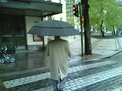
A continuation on the previous umbrella issue. Look at the size of that thing! Must be one of the biggest bloody umbrellas I've ever seen, and what's with the two layer construction? Anyway, it might actually double as a parachute to escape burning buildings.
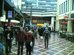
Yesterday was rainy here in Helsinki, and naturally people use umbrellas. In Finland they are wide, mostly black and get in the way in tight places. Can't help but to compare this to Japan, where people are a bit more used to the combination of crowded places and rain. Japanese umbrellas reflect this lack of space by generally being more dome shaped, and often clear so you see through them. Result: they take up less space, there's less risk to poke someone in the eye as the edge drops low, and people actually see where they are walking.
Umbrellas: Japan 1 -Finland 0.
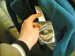
We went shopping for a while as well. I saw this shirt which is sold with a patch that you can sew on by yourself. Does it make you creative, or is it just lazy manufacturing?
When will mobile phones or cars be sold with different standard accessories you can use to customise your own with?

Ended up at the MoA 2006 exhibition again. Teemu is illustrating how you can walk through the mist screen of video work without getting wet (the equipment was leaking a bit though). This fine water mist could actually have other uses as well. It's refreshing and cool, but doesn't really soak you unless you stay in it for several minutes. The first use that came to my mind was to install something like this in airplane lavatories to freshen you up on long haul flights.
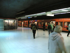
Visited Ruoholahti metro station today. It's the end of the line, so sometimes the trains just stand there waiting for their scheuled departure time. However, coming down the escalator to the platform there's no information on when the train will leave, you actuall have to go onto the platform and look around to find the screens showing the departure time. This results in people running from the escalator into the nearest metro car, and then waitng several minutes for the train to leave. The cars further away stay empty, even if there was plenty of time to walk to them. But how would anyone know if there's plenty of time or not?
A big screen at the bottom of the escalator telling how much time there's left before departure might save a few stressed out commuters from high blood pressure.
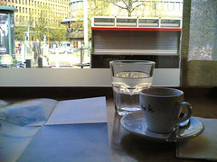
Another good place for espresso, even if the trainee at the counter didn't remember to include the chocolate this time. They usually give you a Fazer Blue, which isn't the ideal with espresso as it's milk chocolate. The espresso is good, and the cup is of good, though unsurprising design. The view depends on the side of the cafe you sit on, but as it is on the first floor you don't really get a vantage point for people watching. Just folks hurrying past the window.
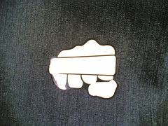
A sticker with warning about washing jeans at wrong temperature (the text in the box didn't want to be seen in the picture). Nice, as it most likely won't go unnoticed.
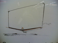
Including this design sketch in a commercial for Samsung's new LCD TV is a nice touch. Somehow they win a place in my heart for showing some real R&D work and not just a glitzy exterior. The truth is that products don't just appear by themselves, and this is a little reminder of it.
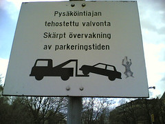
Cars that overstay their parking time will be towed away, and someone decided to add the owners reaction as a sticker. Actually the pictogram becomes even more effective with the little guy added: You really dont want to be upset like him, and thus you'll check your parking time properly.
Or then it could be seen as symbolising car thieves equipped with a tow truck operating in the area.
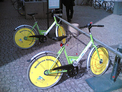
The green speed demons invade Helsinki yet again. These bikes are a real exercise in universal design: In theory they have to fit us all and withstand any abuse. Even if that is utopia they're not bad, actually. For me they're too small, but still 10 points to the city for keeping them alive year after year.

Espresso is a very serious matter. Let me explain why: It is just the right size to be enjoyed while on the move. Buy a latte and you're stuck for at least 20 minutes trying to gulp it down, whle an espresso can take anywhere from 5 to 15 minutes. It's flexible, has plenty of effect and it's a good excuse to stop and watch the crowd for a while.
Cafe Java in Helsinki is the norm to which I compare all other espresso's. For me, the drink itself is just one part of the whole (but needs to be drinkable, however. Any espresso that makes my face muscles twitch is a no go). A good espresso experience is built up of the following points:
-The quality and taste of the espresso.
-The view from the table.
-The design of the cup.
-The water
-The chocolate (it should be dark and bitter).
-Staff of the cafe.
-Other cafe clients.
Cafe Java has the best combination so far out of all the places in the world I've visited. Sure that Starbucks in Shibuya has a good view, but the atmosphere was too hectic, and the espresso was really good in Florence, but there was nothing to see outside the window. Still, all things put together makes Java the number one, and I will use it as default when visiting other espresso serving establishments. These visits will be reported here as well, and by christmas this blog might be a pretty good cafe guide at least.
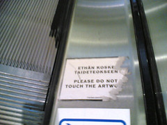
This sticker on an escalator in the Kamppi shopping centre caught my eye. Made me think of all the shops as galleries with art hanging on the racks and put up on the walls. Of course, the design of the spaces that make people shop is also a form of art.
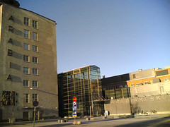
This busstop next to UIAH (which is housed in the old Arabia porcelaine factory) is probably one of my most frequented spots in Helsinki, because I live nearby. Still it was only a few days ago I noticed something pretty obvious: There are two big texts with the word "Arabia" on the walls opposite the busstop, and they use different fonts. The old factory building on the left has the word running down it's side in embossed brick, while the new business centre and library on the right has it cut out of stainless steel. The appearence is different, but so is the font. The newer one could be Arial, the old one I don't have a clue about. When seen separately, they both fit to their respective wall, but seen together from the busstop the difference is quite big. Did the architects of the new building even consider using the old font? Well, at least they had the sense to use capital letters. Anyway, if I find something that looks like the old font, I'm going to see how it would look with the help of the allmighty Photoshop.
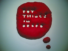
I'll start yesterday. Found this pillow at the MoA 2006 exhibition at UIAH.