Arabia
Originally uploaded by Rollofunk.
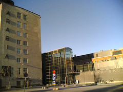
This busstop next to UIAH (which is housed in the old Arabia porcelaine factory) is probably one of my most frequented spots in Helsinki, because I live nearby. Still it was only a few days ago I noticed something pretty obvious: There are two big texts with the word "Arabia" on the walls opposite the busstop, and they use different fonts. The old factory building on the left has the word running down it's side in embossed brick, while the new business centre and library on the right has it cut out of stainless steel. The appearence is different, but so is the font. The newer one could be Arial, the old one I don't have a clue about. When seen separately, they both fit to their respective wall, but seen together from the busstop the difference is quite big. Did the architects of the new building even consider using the old font? Well, at least they had the sense to use capital letters. Anyway, if I find something that looks like the old font, I'm going to see how it would look with the help of the allmighty Photoshop.


No comments:
Post a Comment