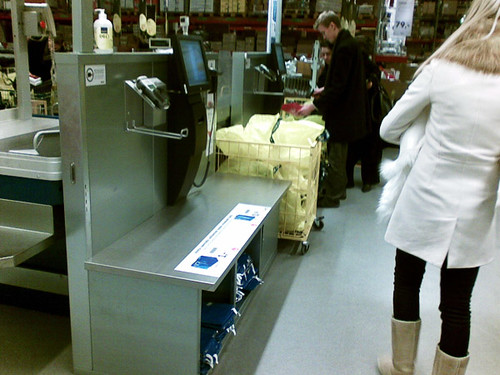
Went to Ikea to check out some stuff, and ended up buying a few drinking glasses to replace broken ones. The self service payment counter was a pleasant surprise. Clear touch screen UI with very simple graphics, clear instructions and no unexpected situations. I think the extremely simple and clear vector-style graphics are an important part of the experience here. There's nothing fancy about them, nor any unnecessary bling. So they really give the user a slight sense of superiority over the system by not trying to make your attention shift to anything irrelevant. Felt safe, and well within my comfort zone throughout the payment event, so a big hat tip to the designers of this one!
Friday, December 18, 2009
Subscribe to:
Post Comments (Atom)


3 comments:
Your blog keeps getting better and better! Your older articles are not as good as newer ones you have a lot more creativity and originality now keep it up!
I have just returned from a trip to Ikea - and was impressed to see the self service isle. I made use of it and it was simple and easy to use.
Unfortunately at the end of my scanning a message flashed up on the screen that I was to be subject to a random double check. I caught the eye of an assistant who asked me to finish the transaction and pay. A security guard was waiting nearby to double check my purchases.
I was quite annoyed and asked that any search of my bag be done before I paid as after payment the goods would be my own personal property and would not allow any such search to take place. I was told to pay first and then be searched.
You may think me unreasonable or pedantic. I don't - I believe that my rights were being infringed in a way that suggested I was a thief and to be treated like a shoplifter.
I refused and left the goods without paying.
Just wondered what your thought are on this as the random search facility is a standard part of the self service operation at Ikea.
Hi Thomas
That sure sounds like a let down on the user experience side. Perhaps that particular outlet has had problems? Not that I can say for sure, as I haven't been to an Ikea of almost a year now, I guess. However, I do think they did a good job with the user interface of their self service counters. If they are making the experience worse through bad human interaction that's a shame, really.
Post a Comment